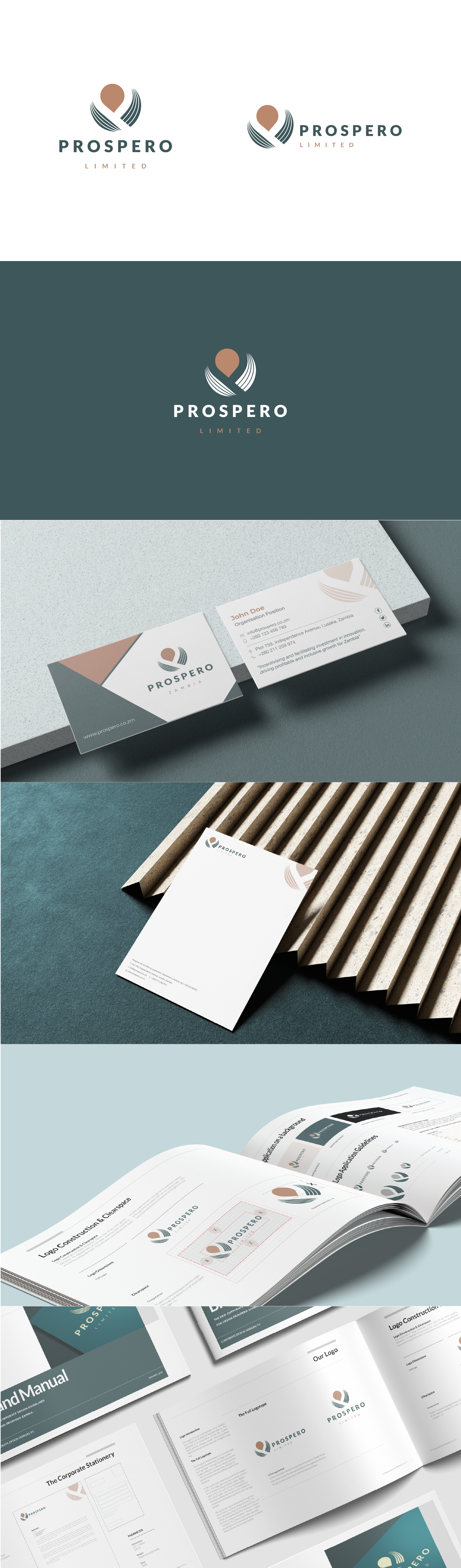
The PROSPERO Limited logo was designed to symbolize empowerment, growth, and support. The central icon subtly forms the letter “P” while the flowing curved lines on either side represent open hands receiving and uplifting SMEs and organizations supported by the brand. The upward motion of the lines conveys progress, partnership, and sustainable growth, positioning PROSPERO as an enabler of opportunity rather than simply a service provider. The deep teal and warm copper palette balances trust, professionalism, and optimism, while the clean modern typography reinforces stability, credibility, and a forward-thinking identity.